Understanding how solar output varies throughout the day, across seasons, and between locations
Stop playing the capacity game. Start having the real discussions about how much energy is available during each hour of the year.
This module covers the following four lessons:
In this lesson you will learn the characteristic bell-shaped curve of daily solar generation, and why the Earth's atmosphere — not just the angle of the sun — drives its shape — and what happens when a panel doesn't face the ideal direction.
In Module 1, we learned that a PV module produces around 450 watts of peak power in full sun. But the sun does not shine at full intensity all day. Solar output follows a predictable daily pattern: zero at dawn, rising to a peak around midday, and falling back to zero at dusk. This produces the characteristic bell-shaped curve of solar generation.
Clear-sky power output over a full 24-hour day (450 W module, European summer)
It is tempting to think the curve's shape is driven purely by the geometric angle at which sunlight hits the module. Angle matters, but the deeper cause is the Earth's atmosphere. A low-angle sun must travel through a much longer column of air than an overhead sun, and every extra kilometre of atmosphere scatters and absorbs more photons before they reach the ground.
Solar engineers call this effect air massStandard solar panel performance is quoted at AM1.5 — roughly the sun at 48° above the horizon — which approximates an annual average for mid-latitude countries.. With the sun directly overhead, air mass equals 1 — the shortest possible path. As the sun drops toward the horizon, air mass rises sharply. At a 30° elevation above the horizon, the path is already twice as long (air mass 2). Near sunrise and sunset, the path can be ten times longer still, which is why the setting sun looks red and dim — the blue photons have been scattered away before the light reaches you.
In the interactive image below, drag the sun or the slider to move the sun from dawn to dusk and watch how the sunlight's path through the atmosphere changes.
At low angles (dawn/dusk), sunlight passes through up to 10× more atmosphere than at noon.
This is the physical mechanism behind the bell curve. At solar noon, sunlight takes the shortest atmospheric route, so irradiance at the ground is high. In the morning and evening, the same sunlight fights through several times more air before it reaches the module, losing energy to scattering (why the sky is blue) and absorption (why infrared warms the atmosphere, not your panel). The end result is that the module receives less energy from the sun.
On a clear summer day in the UK, a 450 W module might peak at around 390–430 watts around solar noon. The peak does not quite reach the rated 450 W because real-world conditions — module temperatures above 25°C, small amounts of soiling, and imperfect alignment — always shave a little off the laboratory-rated value.
One more thing shapes the curve: which way the panel faces. The rule is to tilt toward the equatorThe ideal tilt angle is roughly equal to your latitude — steeper the further from the equator you live, so the panel meets a lower winter sun square-on. — south if you live north of it, north if you live south of it. But the rule is softer than the folklore suggests. Point a panel east and the bell shifts into the morning; point it west and it shifts into the evening. Either way you lose only about 15–20% of the annual total, and anything within 30° of the ideal direction at a normal roof pitch still gives you 95% or more of the best case.
That trade is often worth taking. A west-facing array generates into the evening peak, when power is dearest and the grid is under most strain. On flat commercial roofs, east–west rows facing each other in a shallow V have become standard: more panels in the same space, and a flatter, longer curve instead of a tall midday spike. If your only roof faces the wrong way, that is very rarely a reason not to bother.
Plug a phone into a small solar charger at 7am and the charging is slow. By midday it's fastest. By 4pm it has slowed again. The charger is feeling the same atmospheric path-length effect that shapes every bell curve on every PV module everywhere — just at the scale of one pocket device.
In this lesson you will explore how clouds introduce variability into solar output and why the fundamental shape of the generation curve remains stable.
The smooth bell curve of a sunny day is the idealised case. In practice, clouds introduce rapid, unpredictable fluctuations in solar output. When a cloud passes over a PV module, it blocks a portion of the incoming photons, causing an immediate drop in power output. When the cloud passes, output recovers almost instantly.
Not all of it is blocked, though. Cloud scatters light rather than swallowing it, so a good deal still arrives from the whole sky rather than straight from the sun. Solar engineers call this diffuseIn the UK, roughly half of the light a panel receives over a year is diffuse rather than direct. In the Sahara it is closer to a fifth. light, and it is why a panel in Manchester still works on a grey day — and why Germany, no sunnier than Britain, has built one of the largest solar fleets in the world.
On a cloudy autumn day, the generation profile looks very different from a sunny summer day. The overall output is lower, the peak is flattened, and the curve is jagged rather than smooth, reflecting each cloud's shadow passing over the module. The day is also shorter, with less total time for generation.
Drag the slider to reduce sky clarity and watch the curve lose amplitude and gain roughness
The dashed line shows the clear-sky envelope. The solid curve shows what the module actually delivers.
Despite these fluctuations, the fundamental shape holds: the curve still peaks around midday, with output tapering to near zero at dawn and dusk. Weather affects the amplitude and smoothness of the curve, but not its underlying shape.
If you have rooftop solar and look at your generation monitor on a cloudy day, you will see the output jumping up and down as clouds come and go. On a clear day, the graph is smooth and predictable. This short-term variability is one of the reasons that solar generation needs to be managed at the system level.
The output of a single system is variable — it changes from moment to moment with cloud cover. If you combine two systems the variation is reduced. A cloud passes over one array, then the other, creating a smoother output. Combine multiple systems across a large area and you start to see the bell-shaped curve again.
In this lesson you will explore how day length and sun angle create dramatic seasonal differences in solar output.
Away from the equator, solar output varies significantly between seasons. In the northern or southern latitudes, a clear summer day produces roughly six times the energy of a clear winter day. This is driven by two factors: day length and sun angle.
In summer, days are long — the sun may rise before 5am and set after 9pm, giving 16 or more hours of potential generation. The sun also reaches a higher angle in the sky, delivering more intense light. In winter, the day may be only 6 or 7 hours long, and the sun stays low on the horizon, reducing the intensity of light reaching the module.
When we average out all the daily variations (sunny days, cloudy days, short winter days, long summer days), the resulting 'average day' curve sits between the two extremes. In northern Europe, the average daily peak is around 255 watts for a 450 W module — roughly half its summer peak. This average is what we use for annual energy calculations.
Toggle seasons on and off to overlay them on the same axes — they can all appear together
Seasonal variation is a major factor in system planning. In countries at higher latitudes, solar contributes much more to the grid in summer than in winter. This seasonal mismatch between solar supply and electricity demand (which often peaks in winter for heating) is one of the structural challenges of solar-dominant energy systems.
In this lesson you will learn how capacity factor quantifies geographic variation in solar resource and use it to compare energy output across locations.
The amount of solar energy available varies enormously around the world. Countries near the equator, like Brazil or Kenya, receive roughly twice the annual solar radiation of countries at mid-latitudes, like Argentina or northern Germany. This means the same solar module will produce roughly twice as much energy per year if installed in Sri Lanka compared to Scotland.
We quantify this geographic difference using the capacity factorTypical figures: 10–13% for UK solar, 20–25% for desert solar, 35–55% for offshore wind, 85%+ for nuclear.. The capacity factor expresses the average output of a solar system as a percentage of its theoretical maximum — what it would produce if it ran at full rated power 24 hours a day, 365 days a year.
A sunny equatorial location (e.g., Sri Lanka) might have a solar capacity factor of around 20%. This means that if you spread out all the energy generated over the year, it is equivalent to the system running at 20% of its peak power continuously.
A less sunny location (e.g., Japan) has a capacity factor of around 10%. The same installation produces half the annual energy.
Capacity factor accounts for all the factors that reduce output below the peak: night-time, clouds, seasonal variation, temperature losses, and shading.
The denominator in the capacity factor equation is the number of hours in a year: 24 × 365 = 8,760 hours. A 1 kW system running flat-out every hour of the year would produce 8,760 kWh. No PV system ever does — it is dark for half the time, cloudy for some of the rest, and never at peak irradiance for long — but the 8,760-hour figure is the baseline every annual energy calculation starts from.
At the equator, day length is roughly constant year-round (about 12 hours), and the sun reaches high angles every day. This produces a much more consistent daily generation profile, with less seasonal variation. The annual average equatorial output is therefore much closer to the sunny-day peak than it is in higher-latitude locations.
We can see the effect of this on the image below, dark red areas have high solar output. But we can also see the impact of cloud covers from tropical areas at the equator, like the rainforests in the South America and Central Africa.
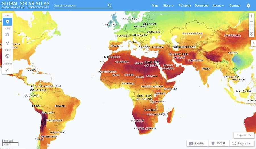
The Global Solar Atlas is a free World Bank / Solargis tool that maps long-term PV output potential for every location on Earth, using decades of satellite-derived irradiance data. Engineers use it to size systems, developers use it to pick sites, and policy-makers use it to compare national resources.
Its headline number is measured in kWh per kWpRoughly 750 in Scotland, 950 across most of England, 1,600 in southern Spain, and over 2,000 in the Atacama Desert — a spread of nearly three to one. — kilowatt-hours produced each year for every kilowatt of panel you install. You will see it written kWh/kWp, and it is the number the Atlas is built around.
Drop any address in and you will see the annual yield, the monthly production profile, and the specific capacity factor for that exact location — all in about ten seconds. Try comparing the UK with Seville, Chennai, and Lagos — the difference is striking.
Two more tricks, and where you see them depends on where you live. TrackersAlmost always single-axis, rotating east to west. Dual-axis tracking adds seasonal tilt for a few per cent more, and rarely justifies the extra mechanism outside research sites. mount panels on a rotating axis so they follow the sun, turning that bell curve into something closer to a plateau. They also need wider row spacing, or they shade each other as they turn, so a tracked farm uses more land per megawatt. Where land is cheap and skies are clear that trade is obvious — nearly every new Spanish solar farm tracks, gaining over 20%. Further north, where much of the light is diffuse, a tracker is chasing a sun it cannot see: the gain drops to 15% or so and most projects stay fixed.
BifacialThe rear face is about 80% as efficient as the front on today's cells. The ground's reflectivity is called albedo — around 80% for fresh snow, 40% for dry sand, barely 20% for grass. panels have a transparent rear — usually a second sheet of glass in place of the opaque backsheet — and cells that collect light from behind as well as in front. They are already everywhere without announcing themselves, because the cells that took over production in the last few years are bifacial by default. Whether they get to use it is another matter. The rear feeds on light bouncing off the ground, so it depends what the panel is standing on: 5–10% over grass, more over sand, gravel or snow, and next to nothing on a roof where the back faces a tile.
Countries with high solar resources generate more kWh per installed kW, which usually makes solar the cheapest generation option. Even in lower-resource countries like the UK and Germany, solar is still competitive because module costs have fallen so dramatically. The message isn't that solar only works in sunny places — it works everywhere — but that the economics, system design, and role of complementary technologies (like storage and grid interconnection) vary with location. The Global Solar Atlas lets you check the local picture in under a minute.
Test your understanding with these six questions. Your score will be shown at the end.
Solar generation follows a predictable daily bell curve, peaking at midday when photons arrive most directly. Weather introduces short-term variability (clouds), while seasons create longer-term variation in total output (driven by day length and sun angle).
The capacity factor captures the combined effect of all these factors, expressing average output as a percentage of peak. Equatorial locations achieve roughly 20% capacity factors; mid-latitude locations like the UK achieve roughly 10%. This geographic variation shapes the economics and system design of solar deployment worldwide.
Understanding the generation profile is essential because it reveals a fundamental characteristic of solar: its output is concentrated in the middle of the day. As we will see in the next module, this does not always align with when electricity is needed — a mismatch that has profound implications for how solar integrates into the energy system.
Next up: In Module 3, we will explore electricity demand patterns and how they interact with solar supply.

You now understand how solar output varies through the day, across seasons, and between locations — and why capacity factor matters for planning and economics.

 Open Global Solar Atlas